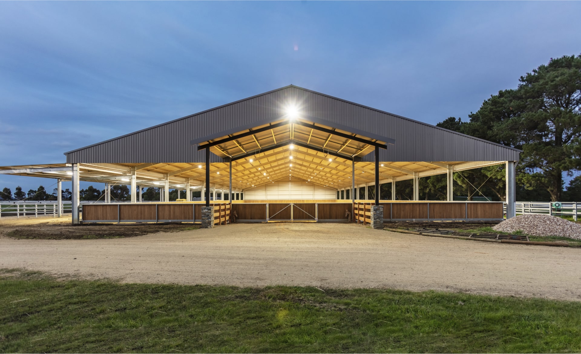
Shade structures are vital to outdoor spaces such as sports courts, playgrounds, and parks. They provide shelter and comfort. When creating a shade structure for your organisation, you will consider aspects that enhance this practical functionality, such as size and shape. However, you may not be aware of colour's essential role in effective shade design.
Optimised and informed colour choices transform outdoor spaces. So, making the best colour decisions for your shade structures is essential. This article will explain colour's role in shade design and the involvement of colour psychology and colour theory. We will also introduce you to colour trends to consider when making shade design choices.

The Role Colours Play in Shade Structures
Colours are vital in determining the mood, ambience, and functionality of outdoor spaces, where your shade structures are a standout feature. The colours you choose evoke certain emotions and feelings. For example, reds, oranges, and yellows create an energetic and vibrant vibe. Blues and greens, on the other hand, instil a feeling of relaxation and calm. Choose colours that reflect the atmosphere you want to create.
Below, we have listed other ways to use colour in your shade structures.
- Defining areas of your outside space. For example, a seating area in a playground may have a different coloured shade than the play section.
- Enhancing comfort by using either light colours to reflect heat and promote a cool environment or dark colours to reflect heat and promote warmth.
- Incorporating brand styling or personal style choices.
- Blending colour choices with the existing environment and structures to create a cohesive vibe.
- Creating visual interest in your outdoor space.
Having looked at why colour is essential in shade structure design, we will consider how colour psychology impacts your choices.
Understanding the Impact of Colour Psychology
Colour psychology is the study of the link between colour and human behaviour. It considers how different colours trigger feelings, emotions, and perceptions. In general, warm colours like red, yellow, and orange promote feelings of warmth, happiness, and energy. Whereas cool colours like blue, green, and purple, are associated with serenity and relaxation.
Looking at colour psychology in more detail, we have listed some common colours and the emotions and feelings they elicit below.
- Blue is most commonly associated with calm and serenity. Other associations with shades of blue include productivity, inner reflection, and imagination.
- Green is normally associated with nature and growth. It can also represent vitality and is said to put people at ease in unfamiliar surroundings.
- Red represents energy, passion, and power. It’s also a colour that attracts attention and promotes appetite.
- Yellow is said to promote mental activity and enhance energy levels. It also promotes happiness. However, this colour is associated with eye fatigue and is usually not prominent in shade structures.
- Orange promotes joy and has a playful and fresh vibe. However, it can also overstimulate the senses and is often used sparingly in shade structures.
- Brown symbolises strength and dependability. It also encourages relaxation and reduces fatigue. In addition, brown is a common colour in nature, so it can help your shade design fit within its surroundings.
Understanding colour psychology helps you determine which colours best fit your project. For example, if you choose colours for a playground shade structure, you may want to consider blue to create calm and productivity in activity-based areas and red to bring energy to physical spaces.
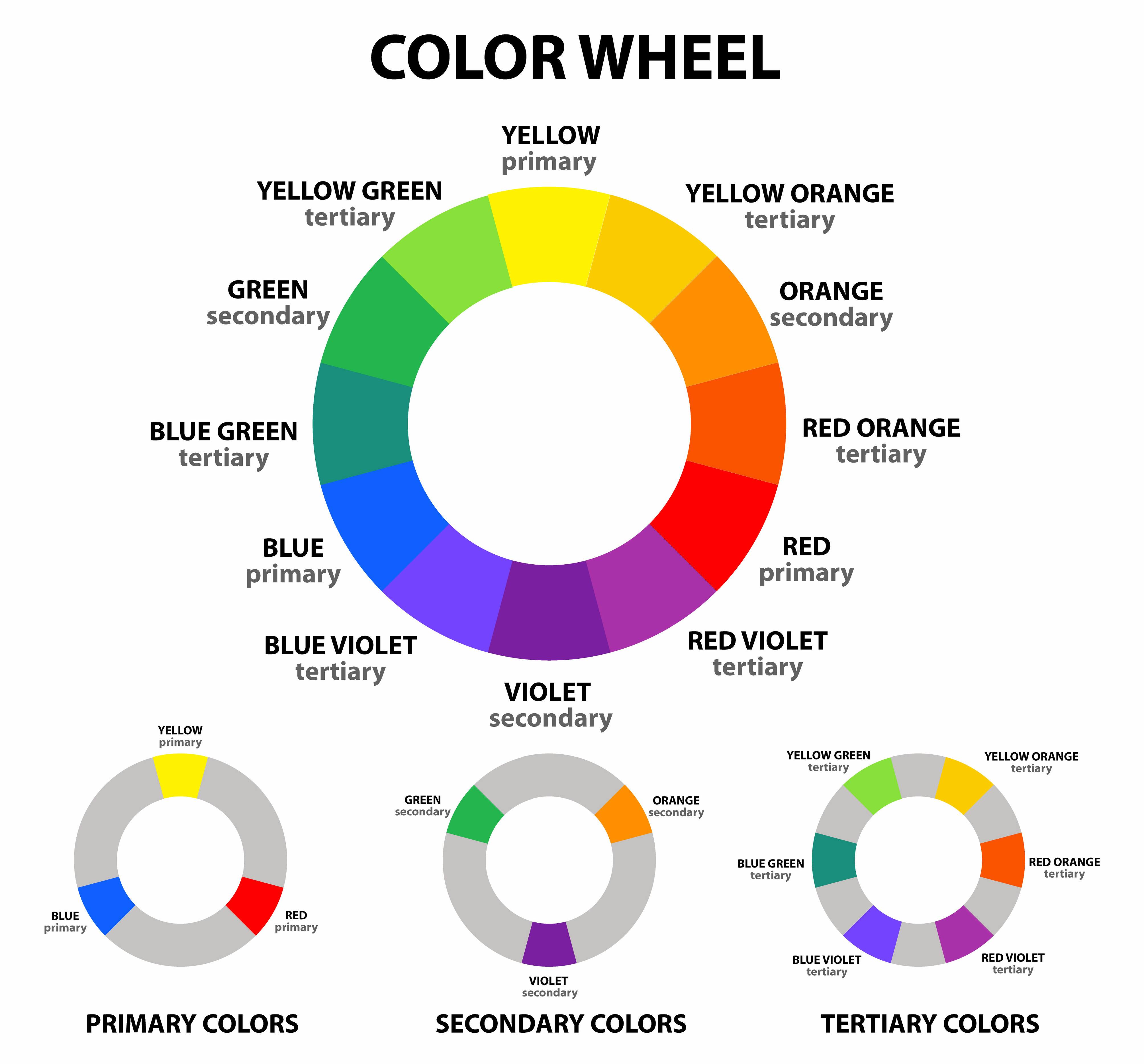
Considering Colour Theory
Colour theory is another factor to consider when designing structures for shade. It derives from the colour wheel which scientists and artists developed. This wheel shows which colours go well together and how to put them together.
The colour wheel consists of:
- Primary colours, red, yellow, and blue that are the foundation of colours.
- Secondary colours, like green and purple, that are created by combining primary colours.
- Tertiary colours that are created by combining primary and secondary colours.
You create a colour scheme when you combine colours using the colour wheel. This scheme can involve your shade structures alone or include the structures as part of a scheme for the wider environment.
Color schemes to consider are:
- Monochromatic – combining tones of the same hue.
- Analogous – combining colours that are next to each other on the colour wheel.
- Triadic - combining colours that are equally spaced on the colour wheel.
- Complementary – combining colours that are on opposite sides of the colour wheel.
- Tetradic – using variants of evenly spaced dual colours on the colour wheel.
- Split complementary – Using colours from opposite ends of the colour wheel and splitting one into two adjacent colours or more.
You can use colour theory alongside colour psychology to determine which combinations are best for your shade design.
Trending Colour Combinations for Exteriors, Including Shade Design
If you are creating a shade structure for a sports court, playground, park, or other communal space, there are some trending colour combinations that may help with your decision-making. You can use these trends to ensure your shades fit your interior and exterior design to create a cohesive look and feel.
Natural Neutral Colours
These colours include shades of beige, grey, and brown. They are perfect for rustic designs and blend well with natural elements surrounding a structure, such as wood and stone.
Tropical Vibe
Combining greens and blues to evoke oceans and tropical forests.
Coastal Tranquillity
Using soft blue shades, sandy beige, and pristine whites to evoke the calm and relaxing feel of an oasis by the ocean.
Clean and Fresh Monochrome
For structures where a sleek and contemporary look is required. Choose a colour that suits this scheme, such as grey, and select shades that convey a modern feel.
Dreamy Sunsets
Sunsets are magical, and this scheme allows you to capture their spirit. Choose dusky pinks, lavender, and soft shades of blue. This scheme is perfect for chill-out spaces.
Vibrant Bohemian
Add a touch of Bohemian quirkiness to outdoor dining areas, including shade structures, by including colours such as oranges, reds, and purples.
Choosing the right colours for shade structures isn't just about making them look good; it's about creating spaces that feel right. By tapping into how colours affect our emotions and using smart design principles, we can shape outdoor areas to match the vibe we want. Whether it's a calm oasis with soft blues and greens or an energising space with pops of red and orange, each colour choice sets the tone. By blending these choices with the natural surroundings or a brand's personality, shade structures become seamless parts of the landscape. With a mix of timeless wisdom and current trends, outdoor spaces become inviting, functional, and full of character. We are happy to discuss your design and colour ideas with you, so you get the result you aim for. Simply contact us to discuss your requirements.
Share this
How Colour Influences Shade Structure Temperature

What Does the Design and Construction Process Involve?